HollandAmericaLine
_SapientRazorfish
Client: Carnival Corp. (Holland America Line and Seabourn)
Duration: December 2016 - March 2017
Rethink the cruise booking experience and establish a new digital identity for Carnival and Partner brands.
TWO BRANDS
Carnival Corp came to Sapient with the vision of re-establishing their online digital presence. For Carnival, this meant the respective websites for each of the nine cruise partner brands. This vision was handed to the Los Angeles team in collaboration with the Miami and San Francisco studio to begin the design work on two specific brands, Holland America Line and Seabourn.
KEY FOCUS

Redesign the existing search and booking experience of a vacation cruise.
Define a new path that would allow users to easily browse through all the possible destinations, ships, routes, etc. Create a site that works seamless across all devices, inspiring users to hop on their next journey aboard.

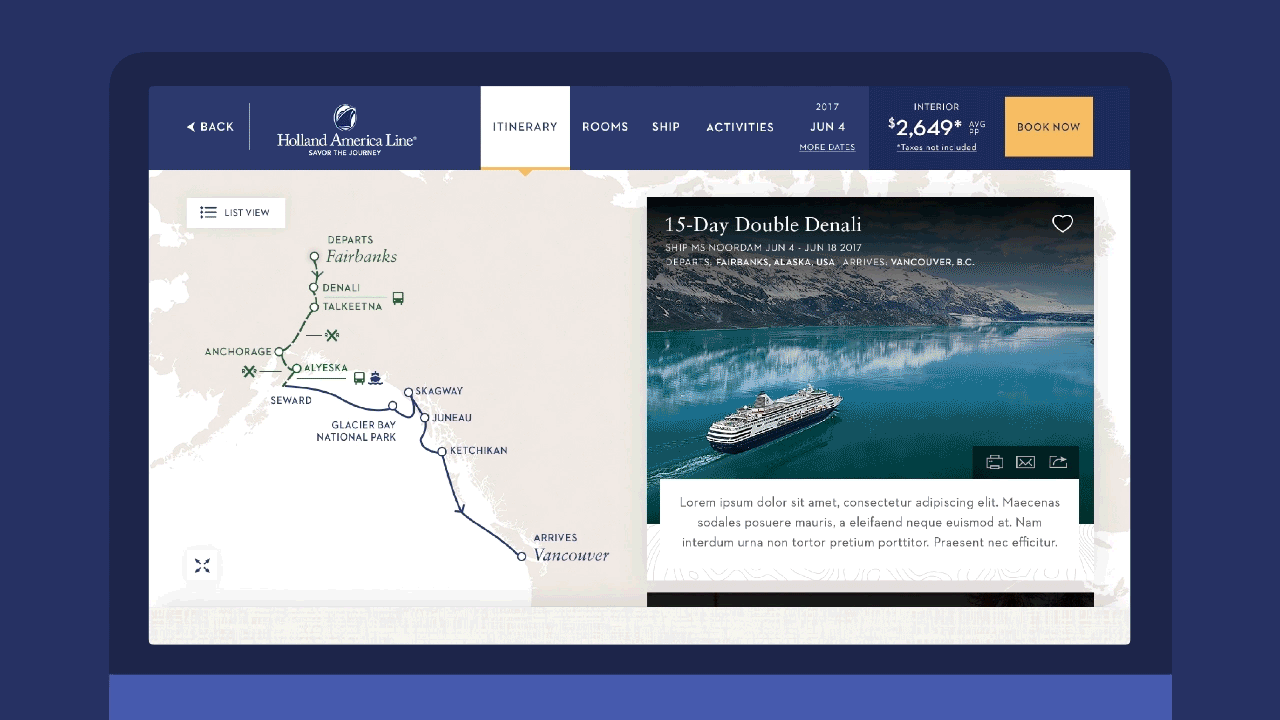
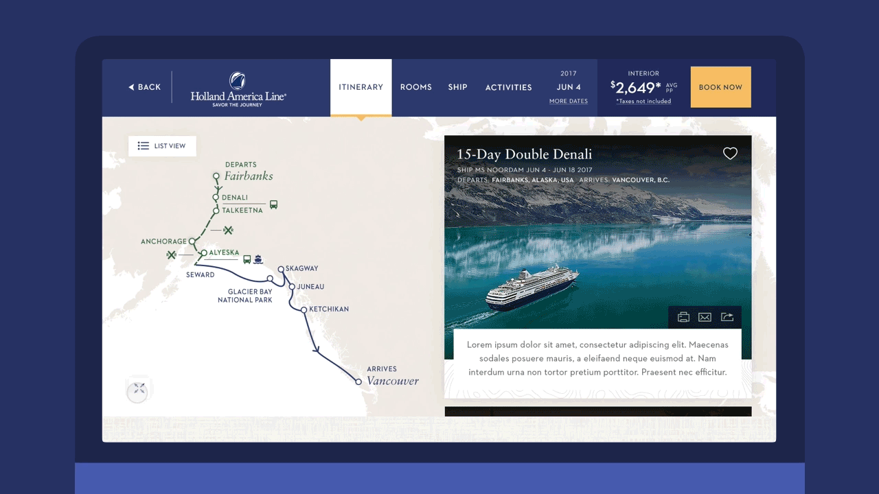
Most of the user's time spent on the website is in the cruise itinerary page. We challenged ourselves to completely rethink the way users interacted with this page by creating an engaging and emerging experience that resulted close to that of being in a Cruise.
EXPERIENCE PRINCIPLES
A set of guiding principles that our directors alongside with the clients established throughout the process.
Be Exceptional
Elevating the experience from beginning to end
Be Inspiring
Brining the journey through the screen
Be Guest Centric
Giving without expecting
Be Responsive
Adding life and motion that create a story
Be Consistent
Presenting content similarly across all brands.
Be Surprising
Anticipating users' needs and interest
THE ARCHETYPES
We had three archetypes that we kept in mind through our design process. Our goal was to simplify the experience for all three users even when they all fell on opposite spectrums of the mosaic pyramid of needs.

The Day Dreamer
The user that wants to explore, be inspired and daydreams about the next journey.

The Straight-To-Business
The user that knows where they want to go and is looks into convenience and deals.
The Travel Agent
The middle man selling the deals to other people. They want to quickly understand the cruise details.
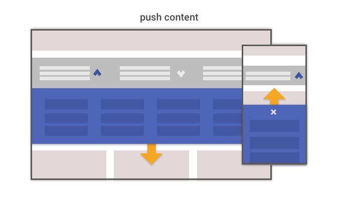
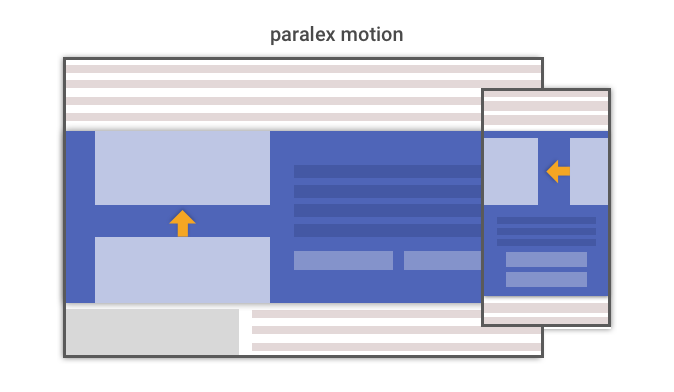
INTERACTION MODAL
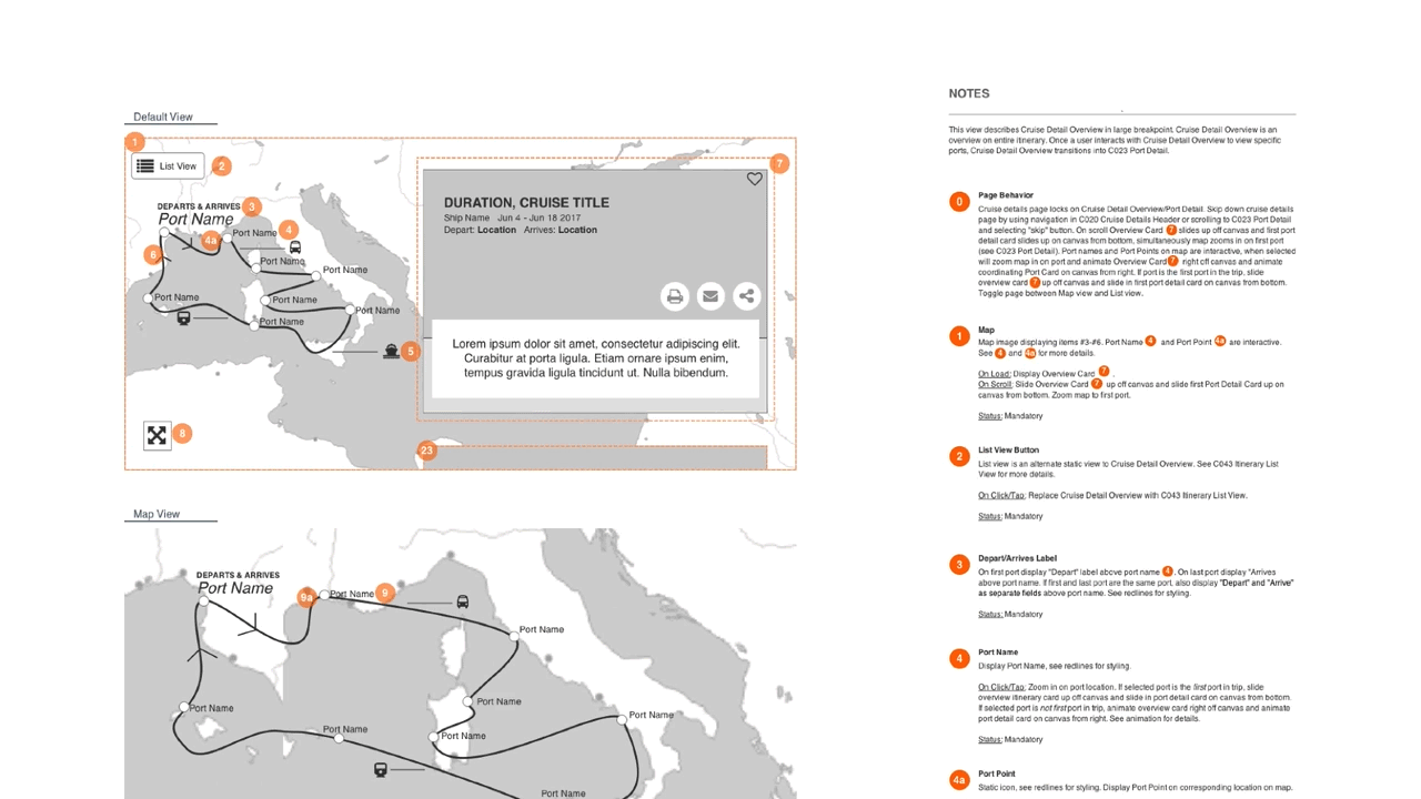
Since we were designing the structure that will eventually be applied to the rest of the carnival partner brands, we didn't start by designing a page within the site, we started by designing a library of components that can be nested across the experience. We looked at individual gestural interactions to map them holistically across the entire experience. Establishing design patterns would allow users to complete the same tasks no matter what brand website they are on, as long as it's the same component.


WIREFRAMES
We designed components, not pages. Our design direction for both brands Holland America Line and Seabourn was going to be used as the example to follow for redesigning the rest of the partner brand websites in the future. Therefore, we focused on creating a library of components for those future teams to grab and nest within their designs. We saw this as an opportunity to establish an interaction language system that would allow future designes to refer to. We stroke for consistency across the board, and having consistent use of components' functionality was a viable way to assure it was one experience across many brands.


As we progressed with our concepts, I quickly mocked up the most complex interactions in Principle to test the motion, as well as to present it to our key stakeholders.
From these animations we were able to change some of our design decisions that led us to our final concepts. From our prototypes
OUR DIRECTION
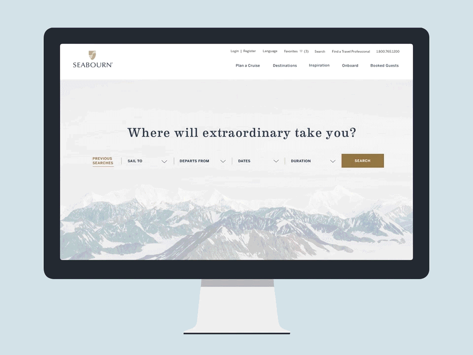
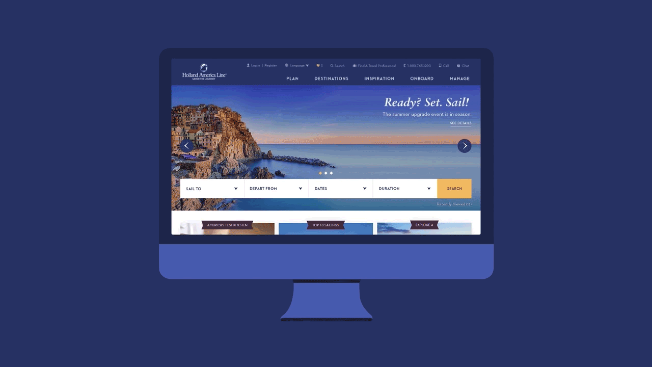
Homepage
A new digital identity for the Carnival brands Holland America Line and Seabourn. Welcoming users to a new site experience that incentivizes to jump right into the next journey by searching for a cruise. We didn't just design the home page for one brand, we designed the structure to follow for the other partner brands.
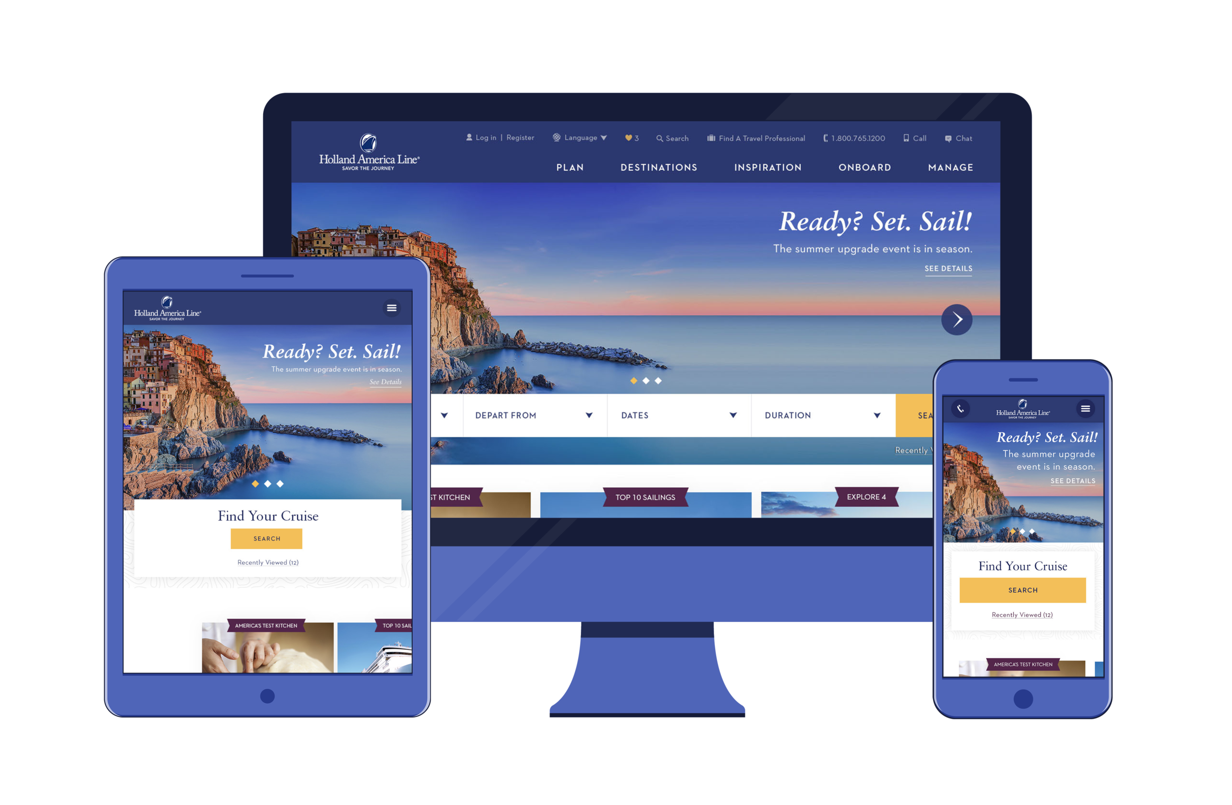
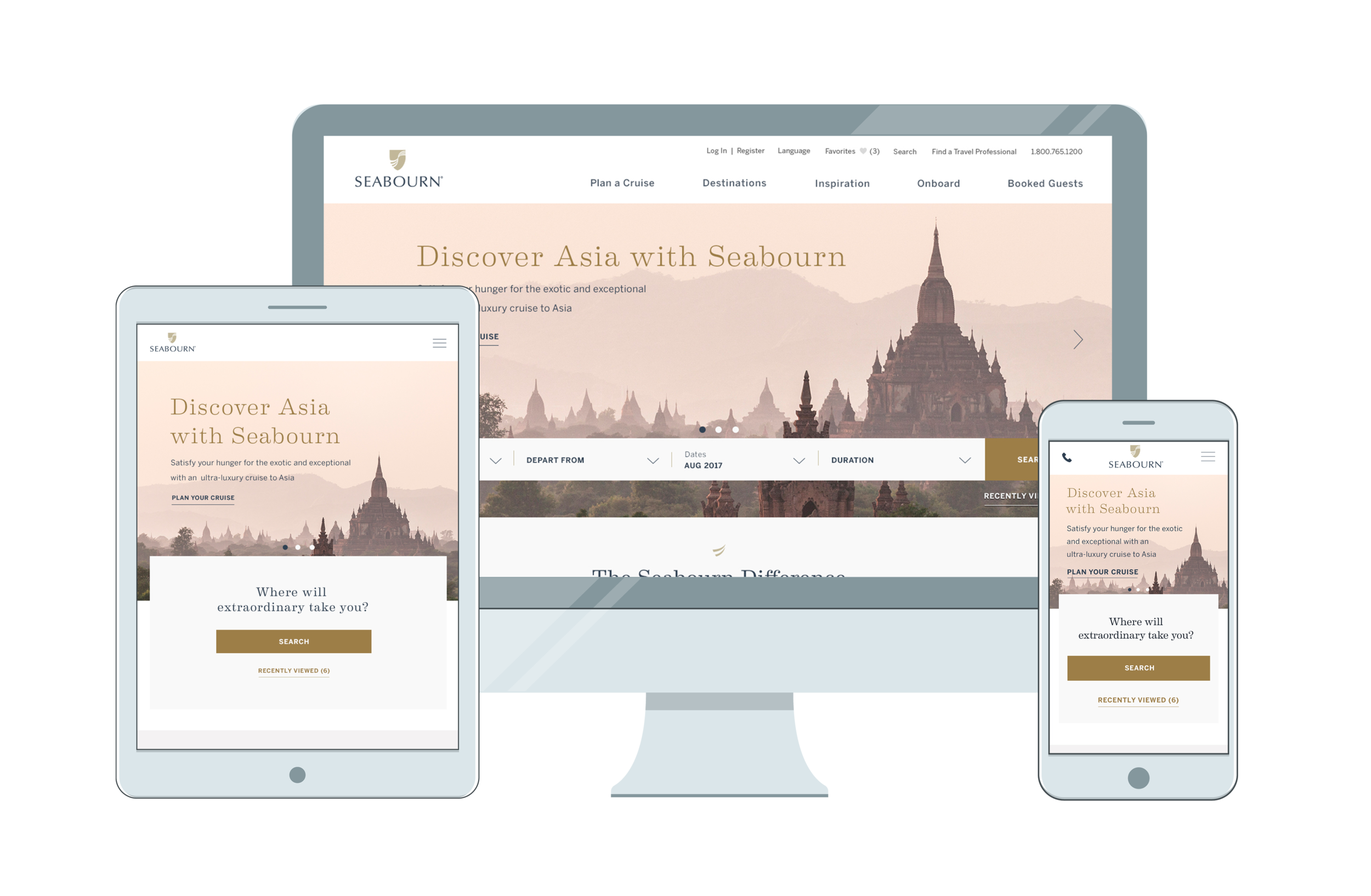
Search Results
One of our biggest accomplishments was the search results page. We nested the same search component from the home page above on results page. Thus, allowing visibility of search criteria with the ability to make an adjustment and seeing the change reflected immediately.


Itinerary Section
Most of the user's time is spent on the itinerary page viewing the cruise details. We created an interactive module that engages users by simultaneously scrolling and learning from the journey's day by day activities through a contextual responsive map of the itinerary route. The goal was to bring the experience of being in a cruise into the screen, triggering on the anticipation of a future next vacation!

PROTOTYPES

ANNOTATIONS
Along with another experience designer, we placed all 99 components in an Axure RP file for documenting functionality and behavior. We used Axure because it allowed teams working remote, to make updates and share these changes instantly with everyone. Thanks to this, other teams were able to get access and use the correct components in their designs... This became literally a glossary of components.
Challenges
One size for all.
Our approach on redesigning both websites for Holland America Line and Seabourn were rather different from previous experiences. Unlike most client work, we couldn't limit ourselves on creating a keen experience that told one brand's story. Our move was to design an interaction modal and a streamlined list of components that would allow for expected-pattern behavior from user interaction across multiple sites. We also thought we could do this with 50 as supposed to 99 components... we were in denial of having a three digit number. We created components, not pages.
Too many cooks in the kitchen
Since the list of stakeholders was so large, it was at most times hard to communicate all latest decisions to everyone. Confirming with multiple teams on concepts, having to convince one team before the other, slowed us down proportionally.
Deadlines and Turnarounds.
As we were working through each batch of work for the two brands, our weekly checkpoints were delivering screens for three viewports. Did i mention pixel-perfect screens? Many occasions the Holland team and Seabourn made us aware of some of their own marketing or legal restrictions, where we had to rethink and redeliver. Before our all-mighty directors brought it up to the stakeholders, we found ourselves at some points losing time just trying to have assets presentable for the checkpoints, rather than taking our time to flush out design properly,
The Team
-Sapient's Team
2 Creative Directos
3 Experience Designers
5 Visual Designers
2 Content Strategists
1 Project Manager
-23456 Web Developers
-Carnival's Team
2 Product Managers
2 Client Leads
Marketing Leads
Many others from both brands Holland America Line and Seabourn
-My Role
The project was based out of Los Angeles, where I traveled to on a weekly basis for about two months straight to work closely with the creative team. As one of the experience designers, I helped ideate through workshops and wireframing sessions for the components on the site. I owned the responsibility of rapidly prototyping -using tools such as InVision and Principle- our key concepts needed for presentation twice a week. I assisted on live user testing from the initial designs and addressed feedback accordingly on the next design sprint. I helped out and worked closely with visual designers to move forward with consistently designing and implementing feedback from clients. In addition, I supported on the creation of the annotations document for each component within the Axure RP file.
40 hours a week? wishful thinking!